
Site Assessment
Location intelligence that names a store, not a score
Responsibilities
Self-directed concept project. I owned the problem framing, the AI interaction model, the surface, and an early prototype. Agents did the building.
Note: built in a day, start to finish. No user has used it. Figures throughout are illustrative, sized to be plausible for the city and the category.
Context
The tool answers whether this is a good place, never whether it is a good deal.
A retail expansion manager brings one location or ten. They need to know whether these are good places to open a store, and why. This is a concept project, built to test one argument about how that answer should be delivered.
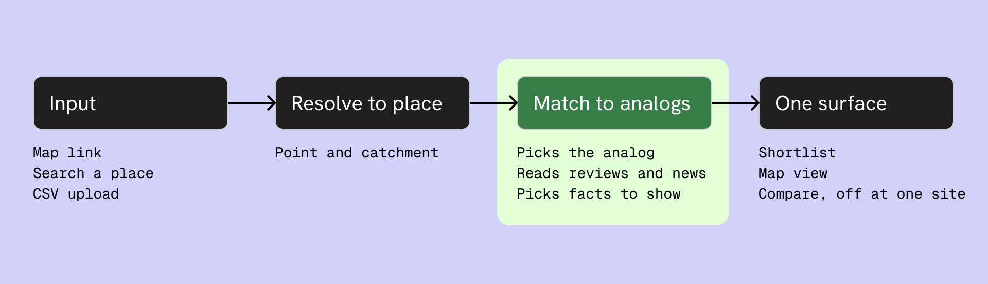
The input resolves to a point and a catchment. It never resolves to a unit. Rent, carpet area, floor, frontage and lease terms sit in no data layer, they arrive in a broker's message. So the tool answers whether this is a good place to open, and never whether it is a good deal. A nine year lease is signed on both, and only one of them is here.
The design assumes the brand has shared its own stores and their performance, because the whole method depends on it.
What I built is one surface and four screens of it. The input step and the compare surface are specified in the flow and not designed. Out of scope entirely: property terms, cold start where a brand has too few stores to learn from, error and empty states.
The problem with a score
A score cannot be checked. A store you have been to can.
Tools in this space return a number. 82 out of 100. The manager either trusts it or ignores it, and both are bad, because a score alone cannot be checked. There is nothing inside it to test against.
An analog can be checked in seconds. Tell them this place resembles their Banashankari store and they already know the sales, the crowd, why it works, and what nearly killed it in year one. All of that switches on the moment the store is named, and none of it has to pass through the interface.
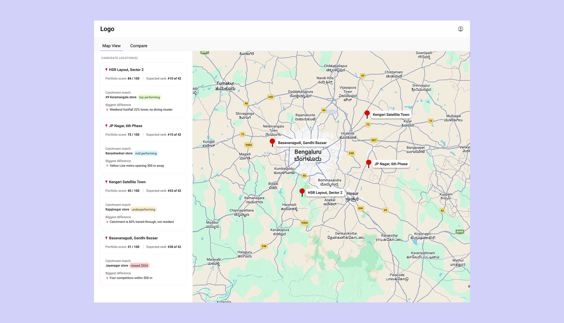
So the number stays and the analog carries the meaning. 73 out of 100 sorts the shortlist. #15 of 42 places the site inside a portfolio they already know. Neither ever appears without the analog and the difference line beneath it, so the number is the short form of an answer they can open rather than a verdict they have to take.
The analog is picked for similarity, never for favourability. If the closest match is a store that closed, that is the most valuable sentence the product can produce. A tool that only shows good matches is a machine for agreeing with people.
This is not a new idea. Analog forecasting is how retail site selection worked before it worked by score, because a chain that already has stores has already run the experiment. The design takes that as the starting position rather than arguing to it.
Naming the analog is also not an explanation bolted onto a black box. Revenue prediction for a new site works by matching it against stores that already exist, so the analog is the model made visible rather than a story told about it.
The prototype put revenue at the top of the card and it read as the verdict. In the shortlist the place name leads, the score and rank sit under it in small type, and the analog carries the same weight as both. Size is an argument, so the number is not allowed to win it.
Where AI sits
The model is the product. The interface is a plain screen.
Two jobs, both finished before the screen loads.
It reads what was unusable. Reviews and news are text, not tables. Two thousand reviews become one sentence about where the incumbents are weak. Years of local news become the fact that this stretch flooded in 2022 and 2024.
It edits. Forty things are true about any location and three of them decide it. Choosing which past store a site resembles, and which few facts are worth saying, is editorial judgement. That is the job that turns five data layers into one read, rather than five layers stacked on a map.
The output is a plain screen. The user never asks a question to get the answer.
The prototype that killed three decisions
Cheap enough to throw away, so I could be wrong before Figma.
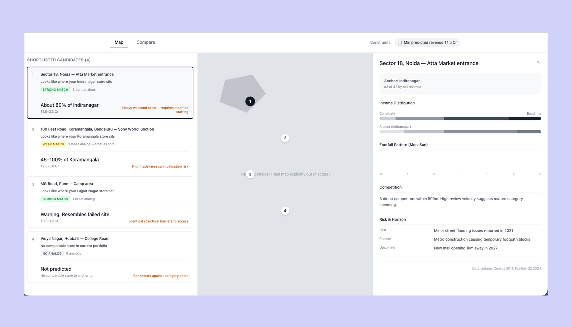
I built a working prototype before opening Figma. Rough on purpose, with a grey box where the map goes. The point was to find out whether the argument held as a screen, not as a paragraph.
Agents did the building, here and through the rest of the work. What they do not do is decide what is worth building, and that is exactly why the prototype came first. It was cheap enough to throw away, so I could afford to be wrong early instead of in Figma.
Three things it settled.
Revenue anchored to a store read badly at scale. About 80% of Indiranagar works on one card and falls apart across four. It became a score and a rank instead.
Match strength was a duplicate label. Strong, weak and no analog repeated what the analog name already said. Replaced with the store's performance band.
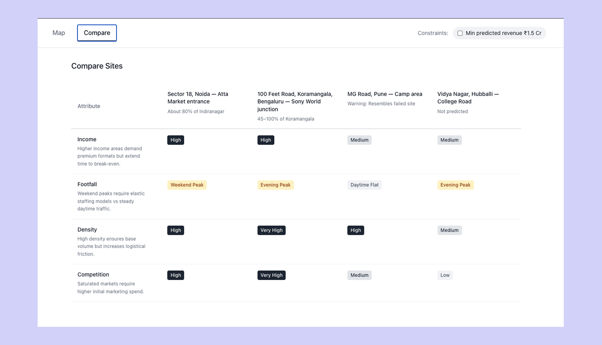
The compare table was full and empty at once. Every cell said High, Medium or Very High. Four columns of that says nothing, and that is where the rule to show only differing rows came from.
One thing it kept. The no analog card. Not predicted, no comparable store to anchor to, is a real answer and better than a guess.
The shortlist
A verdict and one reason. Never three.
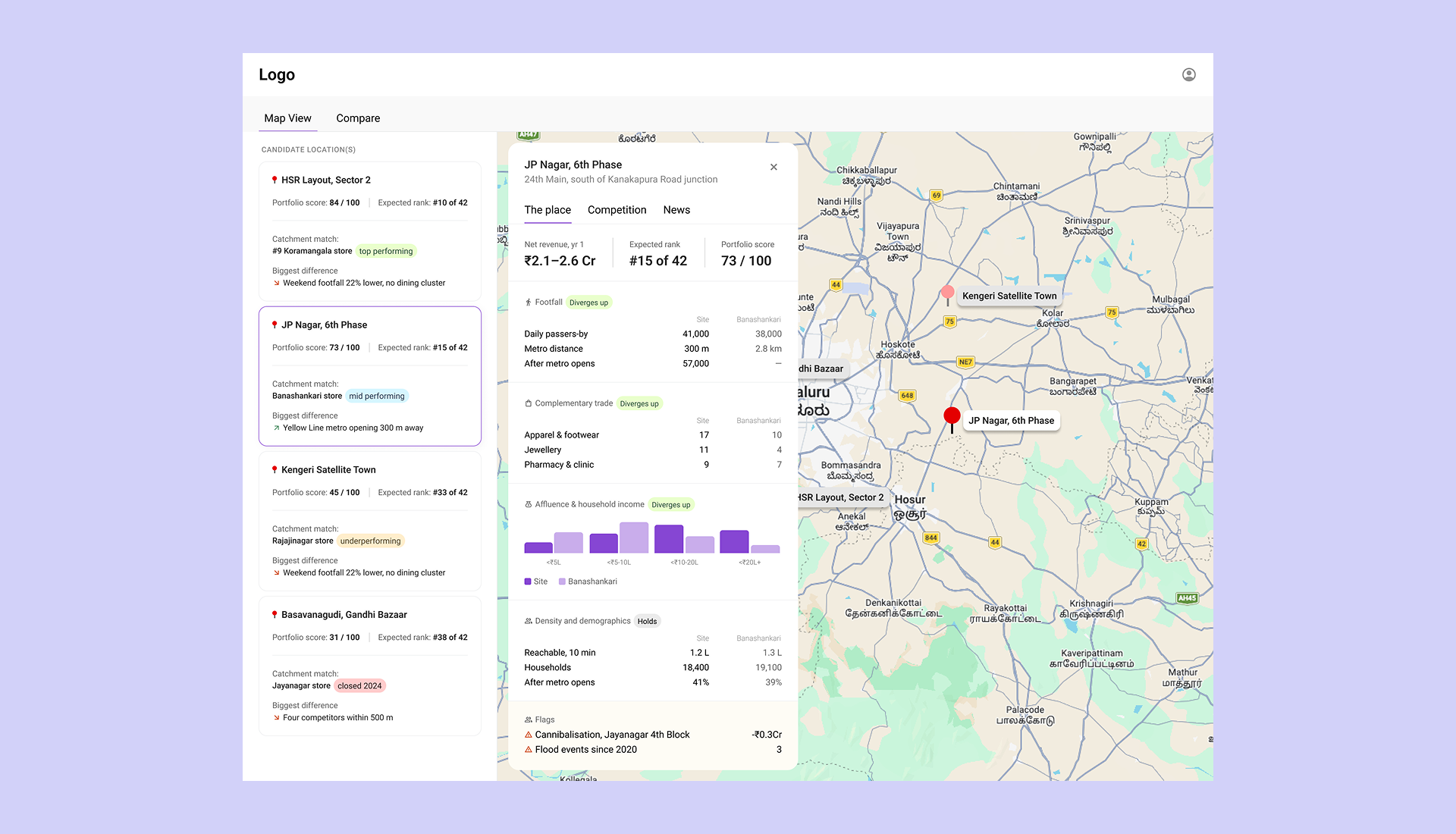
The verdict is a score and an expected rank inside the brand's own portfolio, so 73 out of 100 is also #15 of 42 and the number means something without a legend. The reason is the named analog with its performance band, and one line on the biggest way this site differs from it.
One difference line, not three. At ten cards, scanning stops around the fourth.
Revenue stays in the detail view. Any revenue number on a card becomes the sort key whether it should be or not.
The bottom card is a store that closed. It is in the shortlist because it is the closest match, not because it is encouraging. That is the whole position in one row.
The one control I specified removes sites that do not qualify. It does not reorder them. A sort control would hand ranking back to the user and rebuild the layer-toggle dashboard this design exists to avoid.
The place
Every row is the site against the analog. Nothing stands alone.
The header carries the outcome: net revenue, expected rank, score. Net rather than gross, so cannibalisation against the brand's own nearby stores shows instead of hiding. Revenue is a range, because a point estimate claims a precision the model does not have.
Nothing stands alone. Every value is paired with the analog, so 41,000 passers by means something the moment 38,000 sits next to it.
Diverges up, diverges down, holds. The first two mark where the site is not like the analog, the third where it is. Sections are ordered by divergence, so what decides this site sits at the top and what matches sits at the bottom. The cost is a layout that moves. They cannot learn where a given number lives, and that is the price of putting the deciding fact first.
Income is a distribution, not a median. A median hides whether a catchment is uniform or split, and those are different stores.
Flags carry their cost. Cannibalisation against a nearby store of the brand's own shows as a deduction, already netted out of the revenue above it.
Competition
The count is ambiguous. How fast they are growing is not.
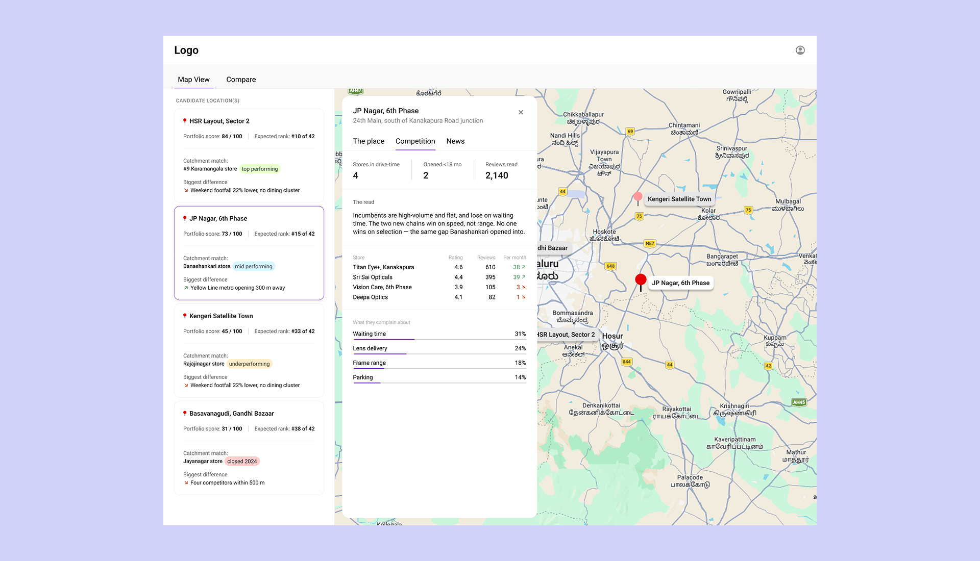
A competitor count is ambiguous. Four nearby can mean a saturated market or a destination street. Same number, opposite conclusion.
Velocity resolves it. Two incumbents pulling 38 and 39 reviews a month, against two pulling 3 and 1, is not four competitors. It is two real ones and two fading. Rating alone does not show that, and review count alone does not either.
Complaints show where they are weak. Waiting time at 31 percent and lens delivery at 24 percent is an operational gap, not a range gap, and that is a different entry strategy.
This is the first of two inputs I added. Every other layer describes what the catchment is now, or was at the last census in 2011. Reviews describe the present, and they are unstructured text: readable by a language model, invisible to a scoring one.
News
Some of what is coming is already inside the revenue number. The rest is yours to weigh.
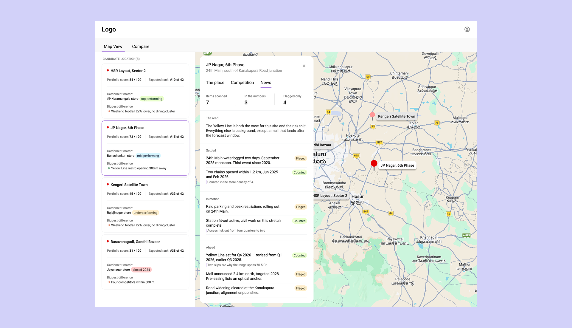
The second input, and the only forward looking one. A store opens six to nine months after the decision, and no conventional dataset says what the catchment looks like then. Local news does, and it carries risk nothing else holds. Which streets flood, what is being sealed, what has been announced.
Three horizons. Settled, in motion, ahead.
Counted or flagged. Counted means the forecast already prices it in. Flagged means it is the manager's call. Without the split they double count, because a metro already inside the revenue number, shown again without saying so, adds optimism that is already there.
That split is a permission boundary. The model prices what it can price and is required to hand back what it cannot, which is the same thing as saying the model ranks and the manager decides.
How I would know it works
Adoption is easy to measure and proves nothing. Revenue proves it and takes a year.
Three measures, each with its weakness stated.
Use. Share of site decisions where the tool was opened before sign off. Easy to measure and weak alone, because it shows the tool is in the workflow, not that it works.
Trust. Does the manager's final pick land in the tool's top three, and can they say why unprompted? Something like: it looks like Banashankari but with the metro. The second half is the real test. If all they can say is that the tool liked it, I have built a score with extra steps.
Truth. Predicted net revenue against actual, twelve months after opening. The only one that proves the product works. The other two are leading indicators for it.
Before any of that, I would put it in front of five expansion managers, each bringing a site they have already decided on, and ask two questions. Does this match what you concluded, and what is missing?
Open questions
Three questions remain open. Cold start, where a brand crosses into a city or a format it has no store in. The prototype refuses to predict and benchmarks against category peers instead, which is honest but thin. A brand with 42 stores hits this every time it enters a new region, so refusing is not a long-term answer. And the gap between a delivery address and where a person actually shops, which is the weak joint under every affluence layer built on e-commerce data.
The revenue model itself is assumed, not built. What I designed is how a prediction gets presented and checked, not how it gets made.
Unbuilt scope is specified separately. Compare, the second surface, is specified and not designed. Two to four sites, only differing rows shown, matching rows collapsed into one line saying how many were hidden.
The bet
A manager trusts a store they have walked through more than a number they cannot check. Everything here rests on that. If it is wrong, the product is wrong, and I would find out in a week of watching someone use it.