
MetricsCart
Digital Shelf Analytics for Quick Commerce
Responsibilities
Sole designer. I owned two features end to end: availability monitoring, and pricing and promotion monitoring. Product, research, and the marketing site that feeds it.
Context
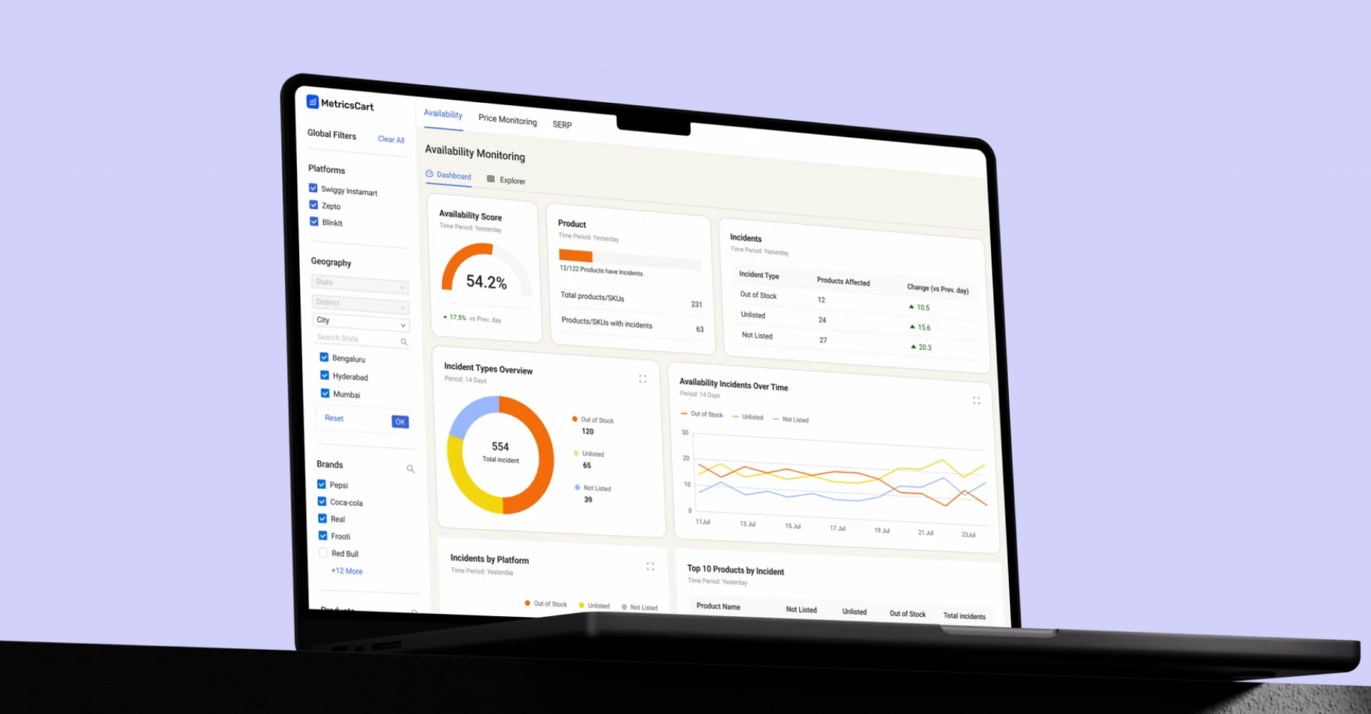
MetricsCart tracks how brands perform on quick-commerce platforms. Blinkit, Zepto, Instamart. A brand needs to know if their product is in stock, priced right, and running the promos they paid for, across every platform and location, every day.
I was handed a doc. KPIs, features, data structure. A spec, not a brief.
That gap was the job: turn a data structure into a product three different people could use. Solo, no research team. I worked with 1 PO, 1 analyst, and 5-6 engineers.
Research
No research budget, no direct line to users. B2B, solo. I had two channels and used them on purpose.
The podcast. MetricsCart runs one. Quick-commerce experts come on as guests. I mined it for mental models: what they check first, what they distrust, how they reason about shelf performance.
Sales. They talk to customers daily and carry the friction: the confusion in demos, the requests that repeat.
The podcast told me what good looks like. Sales told me where it breaks. I triangulated the two into three user types. The users below are derived, not invented.
This was proxy research. I knew its limits, so the harder calls shipped as reversible bets with the uncertain parts flagged for real usage data.
Who I designed for
One product, three jobs, competing needs. That tension drove the architecture.
Brand managers
Every morning,
short session
Lives in: Dashboard
Track their own SKUs. Catch stock-outs and price changes, explain the dip internally.
What changed since yesterday. One fast scan, clear signal.
Agencies
Daily checks,
weekly reporting
Lives in: Dashboard
Manage several client brands. Pull recurring views into client reports, flag issues early.
Switch clients without rebuilding filters. Same view, every cycle.
Researchers
Occasional,
long working session
Lives in: Explorer
Slice data across the category. Compare competitors, export rows into their own models.
Raw rows, not summaries. Deep filtering, every dimension available.
The core problem
The spec was rich. Many metrics, many dimensions, multiple chart types, dense tables. Two forces threatened it.
Density fragments. Without structure, every view becomes its own tool and the user is lost.
The domain moves daily. Stock, prices, promos shift day to day. So an absolute number is nearly useless. "54% available" means nothing. "Down 12% from yesterday" is the whole signal.
So: hold density together, and build around change, not state.
Overview and explorer
The daily rhythm gave me the split.
Dashboard is the overview. KPI cards, each carrying its day-over-day change. Green good, red bad. It answers what changed since yesterday? You open it in the morning and the deltas tell you where to look.
Explorer is the power tool. The tabular view. Once a delta flags something, you come here for why, and where exactly?
Not a toggle. A workflow. The dashboard surfaces the anomaly, the explorer investigates it. One switch moves between them. Brand managers and agencies live on the dashboard, researchers in the explorer, both cross over when the work needs it.
The explorer's columns
The stakeholder wanted every column visible. Across both features that is 20-30. The instinct was fair: brands paid for this data.
A table that wide is unusable, and scanning is the whole job of the explorer. So the question was not which columns to cut. It was which earn a permanent seat, and where the rest lives without leaving the table.
I split columns by how they get used.
Scan-across data stays as columns. The metrics you read horizontally to spot an anomaly: product, availability, price, discount, promo flags, each with its day-over-day change.
Read-about-one data goes in the row. The metadata you only check for a single product after something catches your eye: flavour, pack, location breakdown, category mapping. Each row expands in place into grouped detail. One row open at a time, same table.
I built the expansion as a sub-table first. It puts a second header under the parent's, aligned to nothing, and detail about one product ends up looking like more products. Grouped label and value pairs read as subordinate without any of that.
The table stays narrow and scannable. Completeness is one click away and never lost.
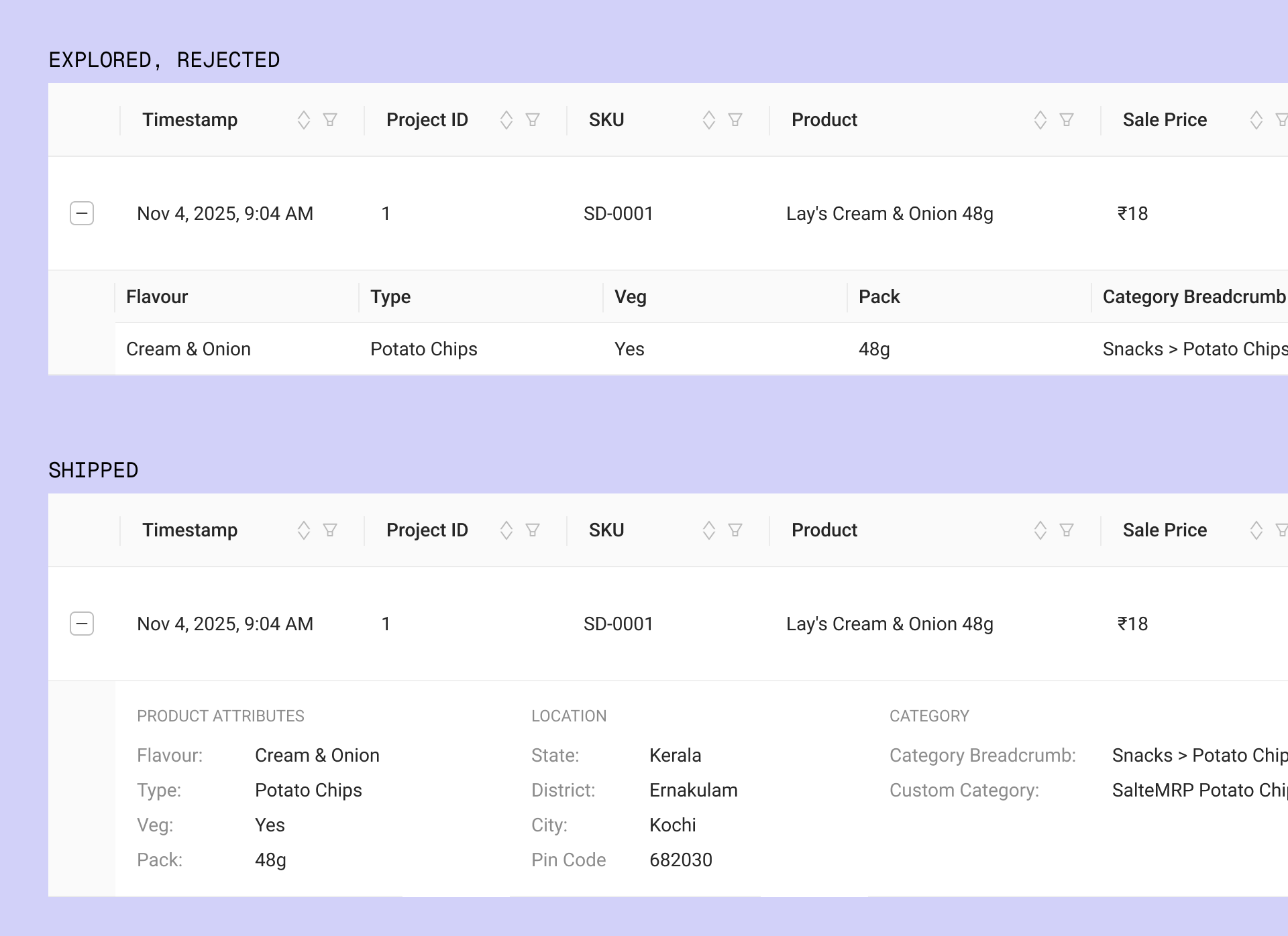
Two ways to hold the metadata. The sub-table repeats a header and aligns to nothing. The grouped panel reads as detail, not as more rows.
How filtering works
Two patterns to decide between.
Chip filter with operators. Brand IS Coca-Cola, Retailer IS NOT Blinkit. Expressive, demos well, but a learning curve.
Column filters. Click a header, pick values, apply. Familiar, immediately legible.
I built the chip pattern to mid-fi, then shipped column filters. Brand managers and agencies pass through occasionally and read column filters on sight. Researchers spend the most time here and would outgrow them, but that is a v2 problem, not a v1 blocker. I did not want the daily user paying a learning tax to serve a power case I could add later.
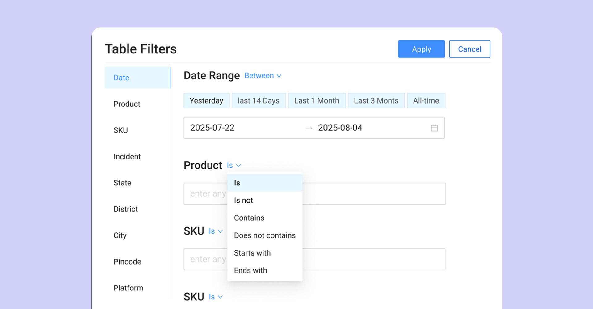
The chip pattern I explored before deciding on column filters.
The expand interaction
Charts on the dashboard are scannable but shallow. A user who spots something wants to dig in without losing their place.
I designed expand as a focused workspace, not a popup. It opens a full-screen surface with two live layers: the chart, still interactive, and the underlying table beneath it. Work either layer and both reflect it. The dashboard sits underneath, one close away.
Geographic drill-down
Incidents track across country, state, and district. The most layout-intensive view.
The map changes representation as you drill in. Choropleth of India at country level, the same gradient across districts at state level, and at district level a switch from region fill to incident points.
That switch is the call. The choropleth answers which regions are worst. It cannot answer where inside them. So at district level the fill drops out and points take over, plotted at city and pin code, sized by incident volume. Intensity and location read on one surface instead of in two views.
The hard part was the transitions. I held one rule: the map's behaviour stays constant, only granularity changes. Same object, more detail. Never a new screen.
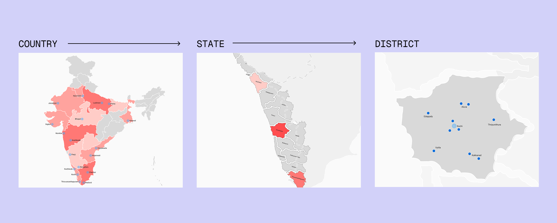
Country to state to district. At district level the fill gives way to incident points at city and pin code.
The marketing site
I also built the marketing site in WordPress, restructured around the problems users arrive with. It now generates around 12 qualified demos a month from a baseline of zero.
Reflection
Proxy research gave strong direction, not ground truth, so the uncertain calls stayed reversible.
V1 is in production. Usage data is not back yet, so none of these calls have been validated against real behaviour. The reversibility was the point. The chip filter earns in if usage shows researchers hitting the column-filter ceiling.
What held across every decision was the spine: build a dense product around what changed, not what is, and never let density fragment the surface.